
How do we elevate ourselves as leaders in the CLL space?
This was the most challenging project you’ll see in my portfolio. We had a number of unconventional roadblocks with this one; we were working with a developer that worked off a digital template so custom css was out of scope. We were also working with an AOR partner that was unable to factor in those digital challenges, making it our job to optimize those assets. This led to an increase in digitally accessibility awareness and asking ourselves: what good is a website of our older audience cant read it?
My role in the project: ux research, graphic design, unofficial team morale booster, client presentation, creative/dev mediator.
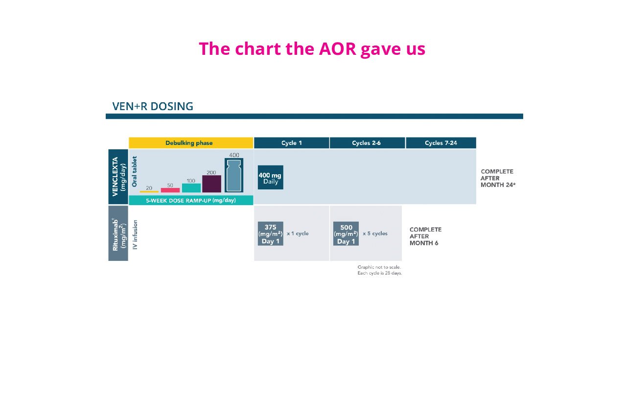

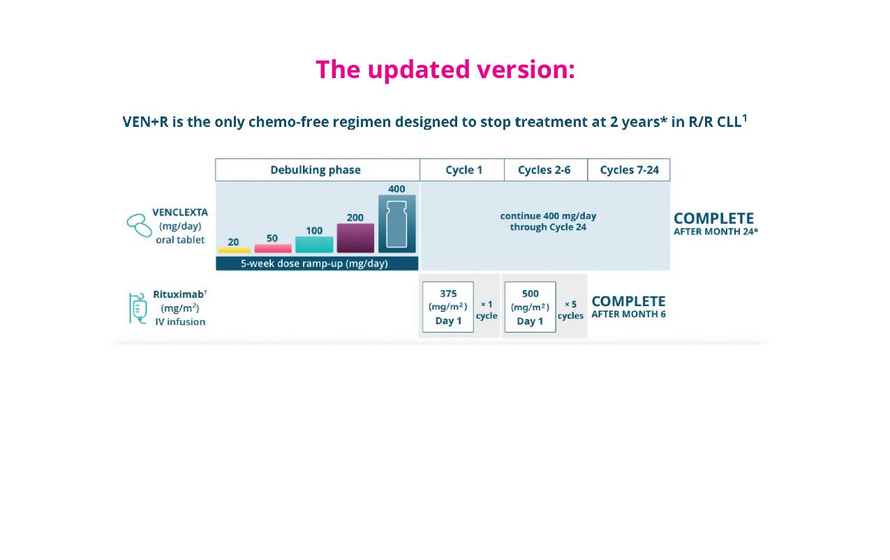

Using colors with purpose
When updating graphics given to us from the AOR partner, we made sure to be conscious of how the colors were being used to highlight information and removed color where is was not necessary.
Although custom css was out of scope for this project, we did push for one larger optimization on the Tumor Burden
Assessment chart. We knew the information was too critical to be missed. By creating an interactive tool, we could help healthcare professionals be more efficient in their CLL diagnosis.
This is live at https://www.venclextahcp.com/cll/dosing/risk-assessment.html


